A practical finish-board exercise for combining existing timber furniture with a new table or sideboard, without relying on matching product names.
You may already own a dining table you love, have timber flooring you intend to keep and need a new sideboard. Finding an exact match can become the wrong shopping task: the room needs a combination you like, not necessarily another piece with the same finish name.
Compare finishes in the context of the whole room. Colour matters, but so do grain, sheen, size and position. The exercise below helps you decide what a new piece should contribute before committing to it.
Start with what is staying
List the timber and timber-look surfaces that will remain: flooring, doors, cabinetry and substantial furniture. Include a painted or upholstered piece if it occupies a large part of the view. You are making a record of what the eye encounters, rather than an inventory of every wooden object.
Choose one starting reference. This may be the largest fixed surface, such as the floor, or a prominent furniture piece you particularly want to keep. Photograph it in the room and write a simple description: “light golden floor, strong grain” or “dark dining table, smooth-looking top”.
These descriptions record appearance. They do not identify a timber species or construction. A photograph cannot establish whether a surface is solid timber, veneer or a timber-look material; use the product specification for that separate question.
Separate lightness from undertone
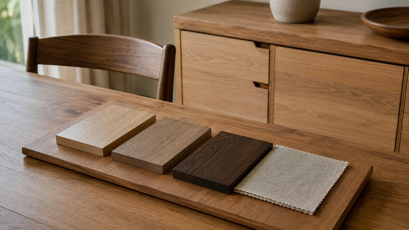
First compare how light or dark the surfaces look. Then ask whether you notice a yellow, red, grey or other colour cast beside the starting reference. “Light” is not a complete colour description: two pale finishes may look quite different together.
Place available finish samples beside each other and view them in the actual room. Check a daytime position and the lighting you use in the evening. If you only have images, keep them as a preliminary comparison and inspect the finish in person or request a suitable sample where available.
As one useful starting approach, West Elm's wood-finish guidance suggests a main tone, a supporting finish and attention to undertones. Treat that as a styling option, not a rule that forbids a mixed palette. Your comparison in the intended room should decide whether you like the result.
Give grain and sheen their own columns
A strongly patterned tabletop and a strongly patterned sideboard can each ask for attention even if their colours are similar. Look at the size and direction of the visible pattern: is it fine, broad, relatively quiet or highly varied?
Then compare the surface reflection. A glossy top and a matt cabinet may feel different together from two quieter surfaces. Look from the entry to the room as well as close up; the reflected light and large pattern can be more noticeable at that distance.
Use descriptive observations rather than a quality ranking. A quiet grain is not automatically better than a dramatic one, and a glossy finish is not proof of durability. The purpose is to choose where you want the room's attention to go.
Assign a role to the new finish
Choose what you want the new piece to do. It might continue a calm background, add a clearly darker feature or connect an existing table with the cabinetry. Write that role before adding more alternatives to your shortlist.
If a candidate looks almost like the table but differs in a way you dislike, compare a more deliberate contrast. For example, a darker cabinet could be worth testing alongside a pale table. That is a design experiment, not a guarantee that darker is better.
You can repeat a supporting finish through something already in the room, such as chair legs or a small timber-framed piece. Repetition need not become a reason to buy extra decoration. If the combination already feels resolved, leave it alone.
Build a finish board that respects size
Create a simple page with one room photograph, the retained finishes and no more than two candidate additions at a time. Label each image with its source and exact finish name. Mark any image that is only an approximate colour reference.
Make the flooring or large cabinet image more prominent than a small accessory. Equal squares can make a tiny timber detail seem as influential as a full wall of joinery. You do not need a precise rendered room; you need a fair comparison of the surfaces that will dominate.
Add nearby upholstery, wall colour and any rug already planned. These surfaces give you the actual setting for the timber choices. Keep the furniture silhouettes visible too, because a bulky dark cabinet and a slim-legged dark table distribute the same colour differently.
Try this illustrative comparison
Imagine a room with a pale golden floor and a retained medium-brown table. The owner needs closed storage. The descriptions below are invented for the exercise and do not represent named products or timber species.
| Surface | Observed appearance | Room role | Question to test |
|---|---|---|---|
| Existing floor | Pale, golden, visible broad grain | Large fixed background | How does each sample look against it? |
| Existing table | Medium brown, quieter grain, low sheen | Main furniture reference | Does the new cabinet compete with it? |
| Cabinet option A | Similar lightness to table, redder cast | Close tonal companion | Is the difference pleasing in this room? |
| Cabinet option B | Darker brown, restrained pattern | Deliberate contrast | Does the larger dark surface feel balanced? |
The exercise does not select a winner from words alone. Place each candidate in the same board position, look from the same viewpoint and compare in the intended lighting. Record the reason for your preference so later shopping does not turn into another search for a vaguely “matching brown”.
Keep appearance and material checks separate
Once a combination looks promising, verify the exact product's construction, finish and care instructions. A finish name does not tell you whether water rings, hot dishes or a particular cleaner are acceptable. Our dining table materials guide covers questions to ask about the surface itself.
Confirm the finish variant on the order and clarify any expected appearance variation with the seller. If comparing a sample with a showroom piece, ask which one represents the item you would receive. Avoid assuming that two products sharing a word such as “oak” will match in colour or construction.
Your timber-finish comparison sheet
| Detail | Retained reference | New candidate |
|---|---|---|
| Exact piece or sample name | __________ | __________ |
| Light, medium or dark appearance | __________ | __________ |
| Observed colour cast | __________ | __________ |
| Grain scale and direction | __________ | __________ |
| Sheen observed in room lighting | __________ | __________ |
| Size and position in the room | __________ | __________ |
| Intended role | __________ | __________ |
| Material and finish confirmed from specification | __________ | __________ |
| Reason to keep or reject combination | __________ | __________ |
Common questions
Must a dining table and sideboard match?
They can match, but that is a preference rather than a requirement. Compare how their finish, shape and scale work together in the actual room.
How many timber finishes should I use?
There is no compulsory number. Start with what you already have, then test one addition at a time. Counting finishes is less useful than understanding which surfaces dominate the view.
Can I decide from product photos alone?
Use them for a shortlist. Colour comparison is more dependable when you can inspect the relevant finish or sample in suitable light and confirm the exact variant.
Bring the comparison sheet when exploring dining-room furniture or buffets and storage. A clear reference and a reason for the new finish make a much more focused starting point than “something that matches”.